Sunday, June 28, 2009

Warhol Style Screenprints


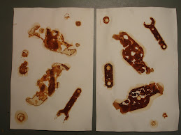
While I was printing my original screen prints and while the screen was wet, I decided to try printing as Warhol did. I took the same image and repeated it over the ground multiple times. I did not clean the screen, I did not try to print cleanly or precisely, nor did I worry about positioning. I just printed one after another like Warhol. Amazingly, it yielded an industrial looking piece quickly and easily.

When thinking about the process, I realized how Warhol viewed this style of art. Warhol often said, "I want to be a machine." In adopting this style of art, he achieved his goal as closely as he could. A machine can not stop to see the imperfections or reposition the screen or paper for centering. It just prints, over and over, without "looking." In doing this exact process, I gained an understanding of how this type of printmaking process was in fact just like a mechanical process.

Finished Screen Print


Here is my original finished screen print.

Tuesday, June 16, 2009

Screen Printing


I tired my first screen print yesterday. The process is quite a bit more complicated than some of the other designs, but still a very mechanical process (This is what Warhol wanted). Screen prints are done using the following steps (this is the abridged version)...
1. Draw a simple design on copy paper. Tape that design down to a drawing board.
2. Place stenciling film over the design and tape down.
3. Cut the design that shows through the film with a stencil knife using light pressure. Peel the green film from the plastic backing.
4. Adhere the film to a silk screen with adhering fluid. Let dry.
5. Peel plastic backing from the screen (this will leave the green adhered film to the screen.
6. Place paper under the screen.
7. Add ink to the screen and pull ink across the screen with a squeegee, creating the design on the paper.

Another Logo Design


Warhol was fascinated by commercial art. He created many of his signature pieces using logos from existing consumer products. I tried this concept with my own consumer product. I used a common peanut butter jar and copied the label, repeating it over the paper. I finished mt design in mixed media (watercolor, colored pencil, and marker).

In doing this design, I was forced to see this product in a different way than usual. Normally, I would just pull this jar from my cabinet and make a sandwich, but this work forced me to see this common product as an artwork. I was able to study the shapes and layout of the label in a way I never had before.

Friday, June 12, 2009

More Stencils


I worked on a few more concepts using stencils. See what you think.

Wednesday, June 10, 2009

Logo Designs


Andy Warhol's most famous pieces were his commercial work using logo designs. He tackled each logo in different ways. Some stenciled, some screen printed, and some painted by hand. These became some of his more well-know works. Among his most notable were his Campbell's soup cans. He also experimented with Brillo Pad boxes, Corn Flake boxes, and gas station logos.

I decided to attempt my own version of Warhol's logo designs. I chose a logo (the apple computer logo), and I repeated it using a stencil process. Once I finished stenciling, I began adding to it using colored pencil, and marker. Its not my best, but it was an interesting experience. I have also been workong on a few more and will post those pictures as soon as possible.

Monday, June 1, 2009

The Last of the Linoleum Prints


I tried one last linoleum print. I don't feel this batch turned out so well. I think the ink I was using was going bad because it was too thick. I printed about six of them and I was not getting any that were up to my standards. See what you think. This one was probably the best of the bunch.